FEEDSMART PACKAGING DESIGN
Overview:
Step into the world of FeedSmart, where every bite is a delight for kids and parents alike. As a brand dedicated to crafting wholesome, irresistible treats, FeedSmart embarked on a mission to redefine children’s nutrition through its packaging revolution with us!
Client Goals/ Objectives:
FeedSmart aimed to create packaging that captivated kids and empowered families to make
healthier choices effortlessly. Their vision? To stand out on shelves while championing transparency about the product ingredients and benefits!
Challenges:
Balancing visual appeal with informative clarity posed a unique challenge. How could we speak directly to children’s imaginations while ensuring parents found all the essential details they
craved? And all within the constraints of limited packaging space?
Approach/Strategy:
Our strategy was as multi-layered as a delicious parfait:
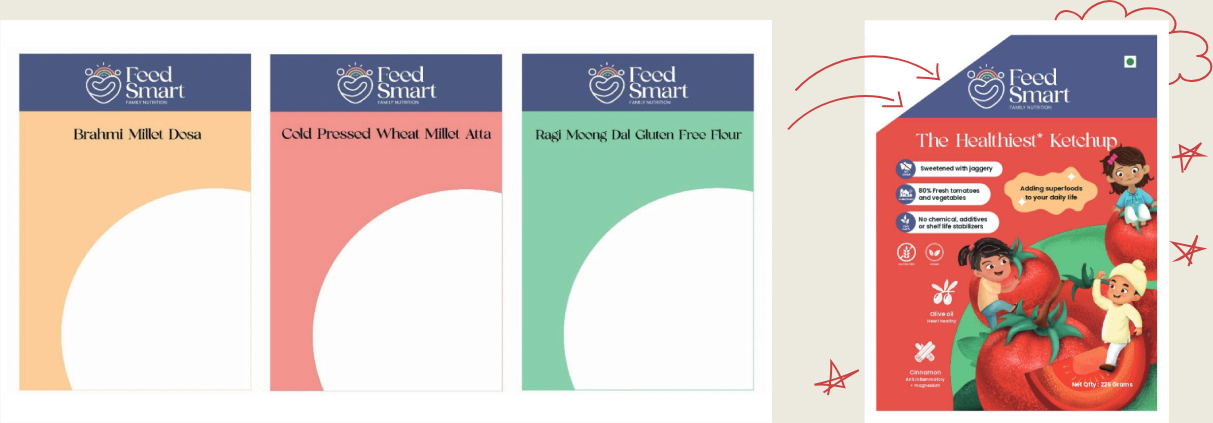
1. Vibrant Illustrations: We brought the packaging to life with playful illustrations, depicting kids joyfully interacting with wholesome foods, instantly captivating young hearts.


2. Infographics: We strategically deployed infographics to pack a punch of information in a
bite-sized space. From ingredient breakdowns to nutritional insights, we served up facts in a
visually appealing format.
A. Pie Chart – Showcasing the ingredients’ quantity

B. Family Chart and the NI Table- Showcasing the nutrition breakdown for the family/consumers

C. Food Pairings/ Recipes

3. Colourful Coding: Through clever colour blocking, we ensured key information popped, guiding
eyes to vital details and enhancing shelf visibility for swift selection.

4. Whimsical Touches: Exaggerated characters’ activities and heartwarming family scenes added a
sprinkle of whimsy, making the packaging not just informative but emotionally resonant.
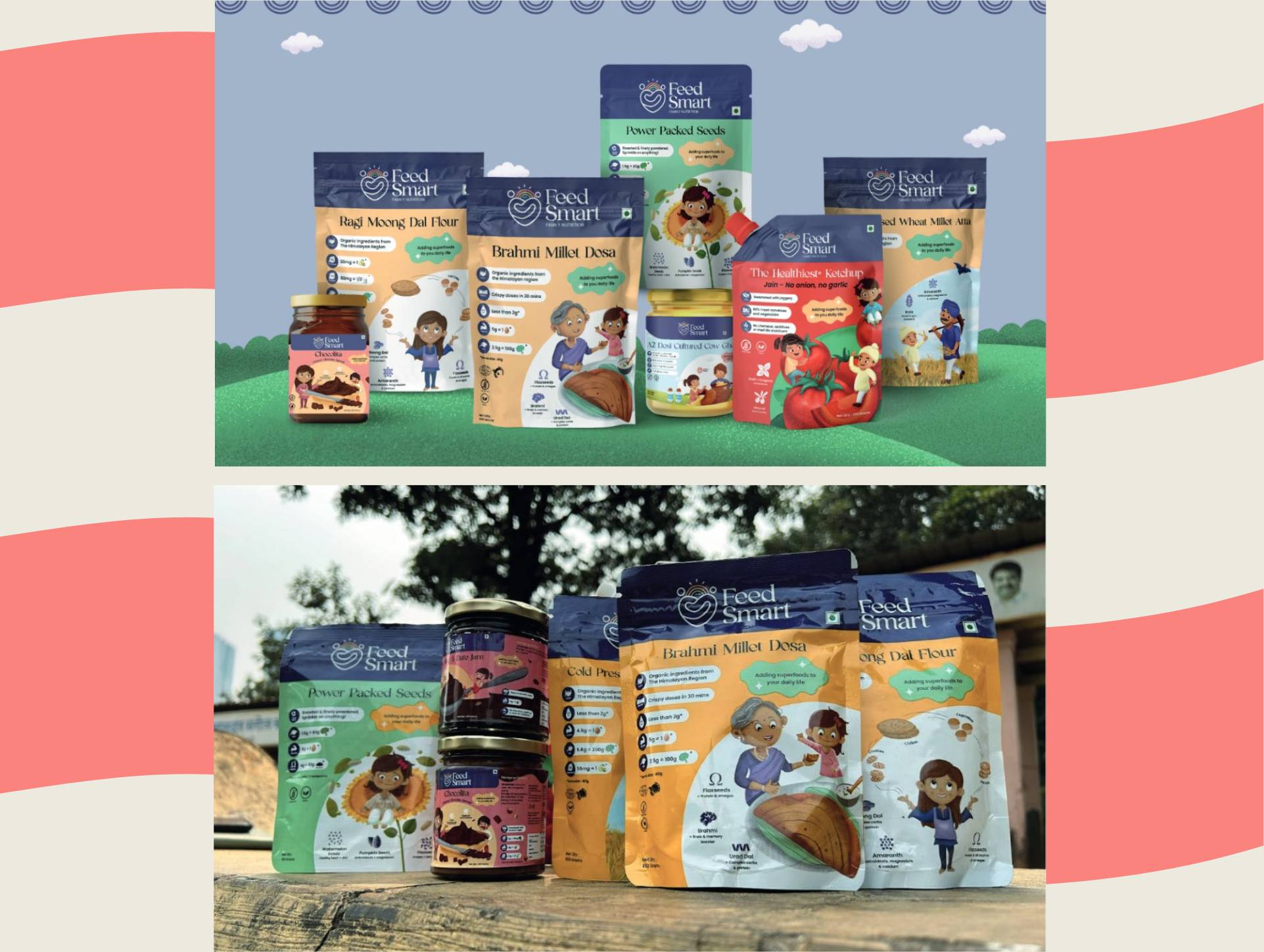
For instance, our portrayal of a multitasking mom on the Ragi Moong Dal Flour pack showcases
the product’s versatility in a single glance.
Complete Process:
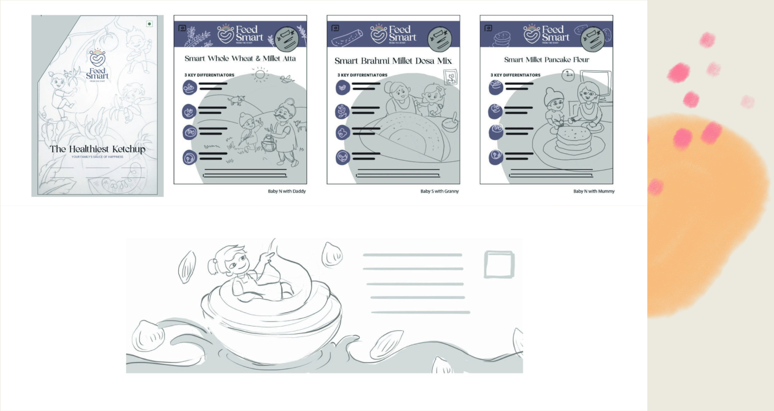
We initiated the design process with brainstorming and conceptualisation, aligning our approach with the client’s vision. From there, we progressed to sketching and refining initial concepts to
establish the visual framework for the packaging design.
As the concept evolved, we focused on illustration and graphic design to create vibrant visuals that
appeal to children while effectively conveying product information to parents. Infographics and
visual aids were strategically integrated to present nutritional information engagingly.
With digital designs finalised, we tested prints and mockups to ensure that the final product met aesthetic and functional requirements. Finally, approved designs were prepared for production, with collaboration between our team and the client ensuring effective communication of the brand message to the consumers.
Results:
The proof was in the pudding – or, in this case, the packaging! With a diverse range of products adorned in our vibrant designs, FeedSmart’s shelf presence soared. And the cherry on top? Glowing feedback from customers, affirming that our packaging not only caught their eye but also their hearts and minds! (Feedback from the client can also be included)
WIP Video: https://www.instagram.com/p/Cx0Ow9eoQd5/
Sketches:

Final Results:

Feedback/ Reviews:

Step into the world of FeedSmart, where every bite is a delight for kids and parents alike. As a brand dedicated to crafting wholesome, irresistible treats, FeedSmart embarked on a mission to redefine children’s nutrition through its packaging revolution with us!

